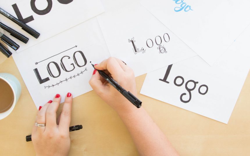
Having recently been commissioned a number of branding projects, I have found myself taking a breather from web-based work and happily re-entering the world of logo design. Spending a little time finding inspiration is important for any designer, so here are a few eye-catching logo designs from 2018/19. They range from iconic wordmarks to fluid multicontextual brand designs. Enjoy!
1 – LoveClip

What’s not to love about this logo? This is a great example of a stripped-down and literal logo design. For a designer, it can be useful if the business name they are working with can be easily translated into visual elements. In this example, “Love” becomes a heart and “Clip” becomes a paperclip. When you can combine these two visual elements into a simple icon, a timeless logo is born. What is also successful is the use of simple, san-serif, uppercase type for the wording, which perfectly compliments the simple line icon.
2 – GiveGive Records

This logo is another great example of visualizing wording, but it gets extra points from me because it has its own personality too! This gives the brand a human touch and a sense of authenticity, which would speak to the target audience of vinyl loving crate-diggers. I love the amount of thought that has clearly gone into this logo, yet it looks like it was sketched on the back of a napkin, giving it a cool and effortless appeal.
3 – Edgeboard


It is great when a logo works as a be-all and end-all, like the first 2 designs shown in this post. But sometimes, and when it makes sense to, designers can take this a step further into the realms of contextual logo design. This is when the logo form adapts to various applications, yet is still clearly recognisable as the brand. This type of fluidity is present in Hampus Jageland’s logo for Edgeboard cutting boards; while a beautifully designed logo on it’s own, it really comes alive in the context of a physical “edge”.
4 – Run Mfg

Another example of fluid logo design, the Run Mfg logo is elegant as a static logo but can adapt to an endless variety of applications. Run Mfg is a company that creates running and sports races, and so the adaptive line, born from the idea of a shoelace, makes a lot of sense in this context. Also, who doesn’t love a cheeky GIF?
5 – MOAA

Uber-minimalists, this one’s for you. The logo design itself is a left-aligned wordmark, while the adaptive forms of the MOAA lettering takes the logo further into a brand. Design agency, InHouse Design, explains it like this:
“A grid-based typographic system of building-like framework forms modular letters that can be squashed and squeezed to suit the given application and provides a unique visual signature.”
Inspiring stuff! Okay, onto the next…
6 – SpaceSettings

Taking us back to something a bit more, let’s say…obvious? Here is a cute little icon-based logo for SpaceSettings. What I like about this logo is the balance between the icon and the text, and I love the little stars which give the logo a bit of texture.
7 – Twins Communications

Something I find really effective in a logo is when it makes you say the brand name out loud. Or at least, out loud in your head! This logo definitely makes me do that, and therefore I wouldn’t forget this brand name in a hurry. As logos are all about brand recognition, I would consider that a twin-win.
7 – Yondr Studio

Let’s finish off with a tasty GIF from Nathan at Yondr Studio. Nathan is a multidisciplinary illustrator, pen & ink letterer and print designer so it is important that he has a logo which aptly reflects his craft. It is delightful to see the logo visualised as an animation, which speaks about design process and the beauty of creation. And well, it’s just pretty isn’t it?


Leave a Reply
You must be logged in to post a comment.